I’ve been reading a superb forthcoming book on management (yes, such a thing can and does exist), [amazon_link id=”0446571598″ target=”_blank” ]The Org: The Underlying Logic of the Office[/amazon_link] by Ray Fisman and Tim Sullivan. I’ll save my review for a bit closer to publication date in January.
[amazon_image id=”0446571598″ link=”true” target=”_blank” size=”medium” ]The Org: The Underlying Logic of the Office[/amazon_image]
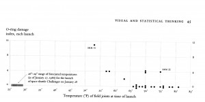
But meanwhile, the discussion in the book on information flows within the Org reminded me of the brilliance of Edward Tufte on how information is presented. Most Orgs use Powerpoint of course. Tufte is a sworn enemy of Powerpoint. Here he is on how Powerpoint contributed to the Columbia disaster, while his brilliant book [amazon_link id=”0961392126″ target=”_blank” ]Visual Explanations [/amazon_link]has a powerful account of how a properly presented graph might have prevented the Challenger disaster. (All his books are brilliant.)

Tufte’s Challenger graph – extrapolate the line to the left to estimate roughly how much damage might be caused by the actual launch temperature
[amazon_image id=”0961392126″ link=”true” target=”_blank” size=”medium” ]Visual Explanations: Images and Quantities, Evidence and Narrative[/amazon_image]
Good management, like good decisions of any kind, depends on using information wisely. And that depends on how the flow of information is structured and then presented, given the limitations of our perception and reasoning abilities.
